
Mobile Application Redesign
Health Management Mobile Application
App Redesign - iOS - Design System - Usability Testing - Workshops - Product Design - UX/UI Design
Project Overview
Our team reimagined the mobile experience with the future of the company in mind. I led the charge in the redesign, building the first mobile design system and integrating key behaviors into the app to improve users’ health outcomes. The app was launched in 2022.
Project Outcomes
Increased number of monthly active users by 21%
Increased program sign-up by 15% by making it easier to sign up for a program
Created a design system that sped up design delivery and reduced engineering costs.
Goals
Develop a mobile Design System
Integrate education-based health programs
Engage with users between health station visits
My Role
As the Lead Product Designer on this project, I worked with the Product Manager and Engineering team to define scope, feasibility, and priority. I developed design direction and worked closely with the mobile product designer to execute on designs.
Background
Higi had a mobile app, but it had not been updated in some time and was unable to scale with the company, limiting the growth of our consumer programs. Most important functionality was only available on Smart Health Station which made it difficult for users to get the full benefit of Higi services.
Out with the old
Main challenges to address from a UX POV:
Access to health programs without Smart Health Kiosk
Ongoing engagement with users
Legacy code and lack of design system made it time-consuming to design and develop
Discovery
Alignment
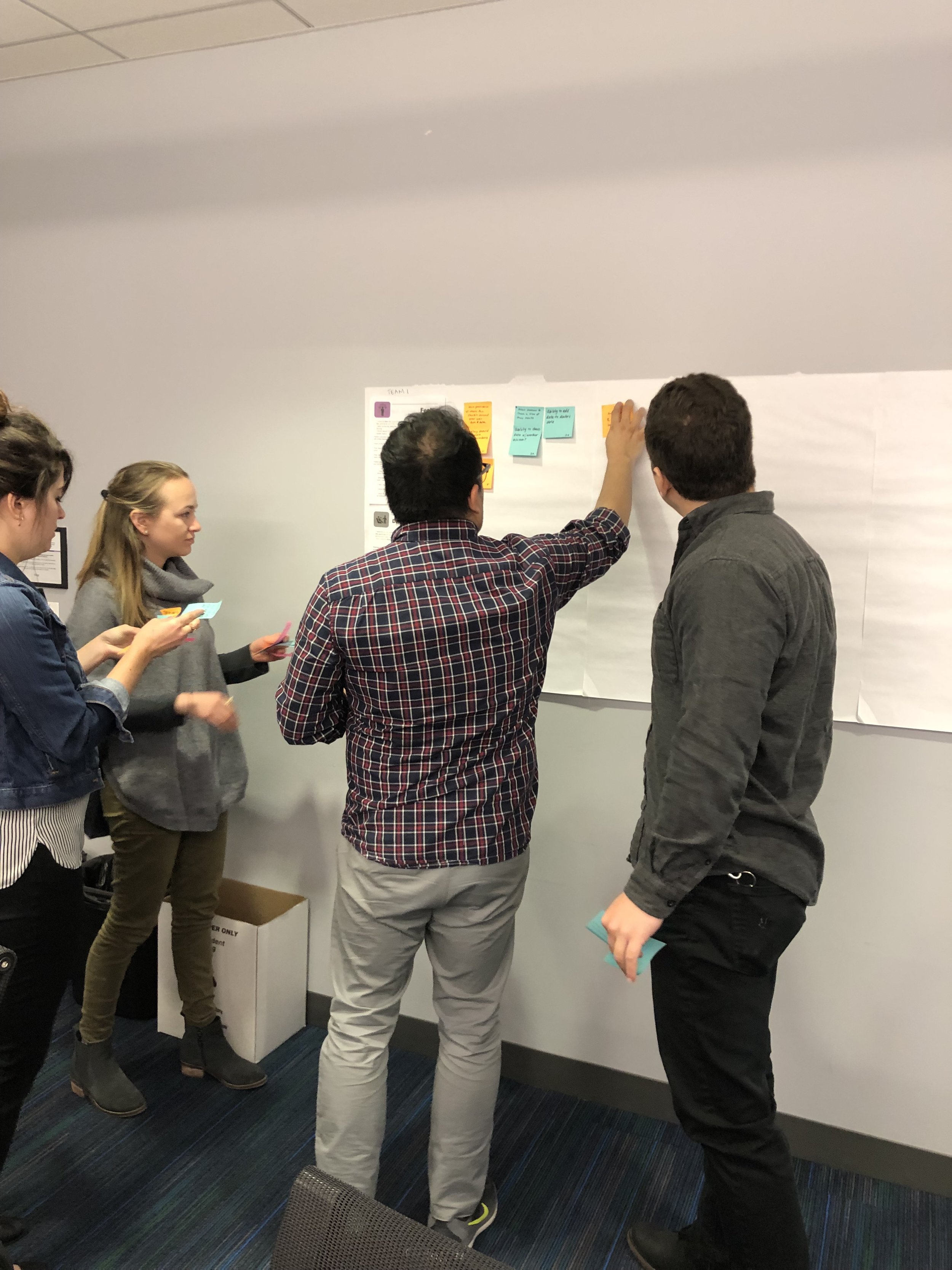
Like any good design-thinking product team, we started with a brainstorming session to generate ideas and align on what problems to solve with the mobile app. I moderated a series of workshops with members of various teams to surface ideas and align the team on areas of focus. Using the information gathered in the workshop, the team was able to define an MVP, and the engineering team got started on defining the underlying technical architecture.

Key Focus:
Workshop: Develop HMW statements, prioritize key features, and understand ideal user journey
Rapid prototype and feedback

User Journey
One of the most helpful activities we did was a future state journey map to understand how the mobile application fit into the larger ecosystem of the Higi’s health management. The team developed 2 user journey maps for the 2 different persona types.


Prioritizing opportunity areas
Through a series of workshop activities, the team prioritized areas to focus on during the redesign. This allowed the team to align early on for where to focus design and development efforts.
Competitive Analysis
Below are a few excerpts from the competitive analysis. Our team mainly focused on health based apps, especially those who focus on blood pressure tracking.
Key takeaways:
Help user’s come to conclusions and take actions of their health
Data should be central to the experience and user’s at the center of their data
Data tracking should account for the frequency of use variability


Creating the First Design System
The current application was outdated and couldn’t scale with the company. The design team was passed legacy files with no design system, and the engineers found it difficult to update the application on the current technical limitations. Redesigning the mobile application was the perfect opportunity to get Higi’s first-ever design system in place. The design system increased speed, improved the UI quality and freed up time to work on more worthwhile tasks. Our team:
Conducted an audit of the current application
Build a system for the most commonly used components
Add onto the system when needed and maintained the system
Key decisions:
Modernize the look and feel of the app
Focus on accessibility including color contrast ratios, font size, tough target sizes, and alt image text.
Use Figma’s components to maintain consistency

UX/UI Design
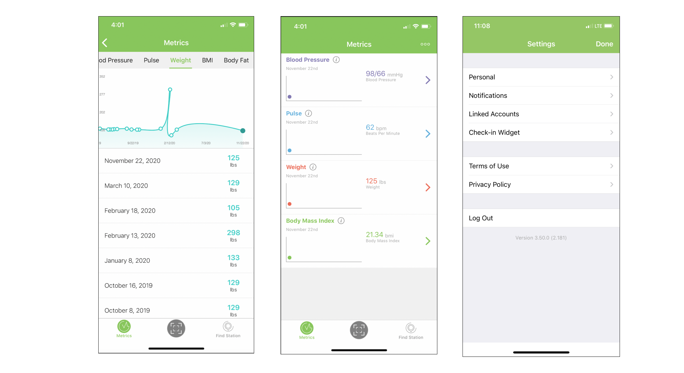
Health Numbers Tracking
While users took essential biometric tests such as blood pressure and weight on the Smart Health Kiosk, the mobile app allowed users to track and share biometrics on the go. The team worked with American Heart Association (AHA) and clinicians to develop longitudinal views of health data.
Key focus:
Make it easy to understand biometric readings and level of severity
Provide a personalized way of viewing data based on the person.

Health Programs
Health programs are a major revenue driver of the business and provide specific health information to the user based on health needs. Our team created a way for users to find and sign up for programs on the mobile application, complimenting the Kiosk experience.

User Flow

User Research
Usability Testing
Throughout designing and iterating on the mobile application, many usability tests were done for smaller features using the remote unmoderated user testing platform User Zoom. For the final usability testing session before launch, I conducted remote usability testing with 5 users. I recruited and scheduled participants, developed a moderator’s guide, moderated the usability tests, and analyzed the results. While there were no critical usability issues, the team was able to implement smaller improvements before the launch of the application.
Key areas to explore:
Are users able to retrieve and view health numbers?
Are users able to draw conclusions from health numbers?
Does current terminology and explanations make sense to users?
Key findings
While participants were able to find health numbers, it was difficult to draw conclusions (such as severity) from them.
Difficulty comparing different type of health numbers like weight, blood pressure and body fat percentage
Some terminology (such as “Metrics”) wasn’t clear.
“The Higi App is a great way to manage and track my blood pressure. I can clearly see how my health is and if I need to make changes.”
- Higi User